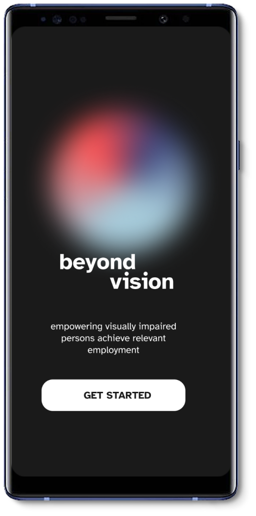
Beyond Vision
Empowering visually impaired persons achieve relevant employment.
Project Overview
Type: Academic - Solo
Timeline: 12 weeks (Jan-April 2022)
Role: UX Researcher, UI/UX Designer
Tools: Figma, Invision, Photoshop, Illustrator, Indesign
Beyond Vision is a mobile app developed at BrainStation’s UX Design Bootcamp from Jan-April 2022. This capstone project entailed creating an end-to-end UX design process involving research ideation, development of a mobile interface and brand. This app was designed for Android platform.
Artifacts: Flows, Wire-Frames, Information Architecture, Sketches, User Interface Library, Branding, Responsive Design.
Skills & Methods: User Research, Interviews, Prototyping, Usability Testing, A/B Testing, UI Design, Marketing Website.
Process Roadmap
While approaching this subject for capstone I followed UX process that was holistic, inclusive and accessible. Always keeping the user at the centre of the design process.
1
Empathize
Problem Space
Secondary Research
Primary Research
2
Define
User Persona
Experience Map
3
Ideate
User Stories
Task Flow
5
Test
Usability Testing
Modifying Wireframes
Hi-Fi Wireframes
4
Prototype
Paper Sketches
Low/Mid-Fi Wireframes
6
Refine
Brand Identity
Hi-Fi Prototype
EMPATHIZE
PROBLEM SPACE
Many individuals with visual impairment face barriers to meaningful employment. Legislation has been put in place to ensure employment equity, however, little is known about the employment profile and experiences of people with seeing disabilities.
SECONDARY RESEARCH: OVERVIEW
In Canada, 75% of individuals with a seeing disability were out of the labor force due to their condition, the remaining identified barriers that prevented them from working which included,
(i) too few jobs available (20%)
(ii) inadequate training/experience (19%)
(iii) past attempts at finding employment were unsuccessful (19%)

SECONDARY RESEARCH: CONDITION
1.5
60%
Million Canadians reported having a seeing disability
of the individuals with a seeing disability were between 25–64 yrs of age
44%
45%
of Canadians with seeing disability were from the province of Ontario
of Canadians with seeing disability had a high school diploma/certificate or less
SECONDARY RESEARCH: EMPLOYMENT
To refine my problem space and define the demographic that I would like to address, I conducted further research on working age adults (25–64 years) with a seeing disability and found that: Out of the estimated 892,220 working-age adults,
54%
were employed
6%
were unemployed
40%
did not enter the labor force
SECONDARY RESEARCH: BARRIERS
Lower employment rates for individuals with visual impairment, and the work participation disparity between this population and the “abled” community, have been attributed to several physical, procedural, and attitudinal barriers:
Physical Barriers
Lack of accessible buildings and workstations.
Lack of transportation and reliable commuting options.
Lack of signages.
Procedural Barriers
Inaccessible or insensitive hiring processes.
Lack of workplace accommodations.
Lack of transparency in communication.
Attitudinal Barriers
Assumptions, beliefs, stigma and stereotypes about persons with disabilities.
The use of assistive aids leads to negative evaluation of intelligence, achievement, and appearance.
Use of a cane or guide dog significantly reduced the odds of being employed.
PROJECT OBJECTIVE
The goal of my investigation is to learn about barriers to employment among partially blind persons and how it affects them.
To narrow down my scope I decided to focus on the demographic of ‘partially blind’ as it encompasses a wider range of the visually impaired persons. I believe having a universal approach will have the maximum impact on the problem space.
Ultimately, my project aims to make it convenient for partially blind persons to find and have access to meaningful employment opportunities.

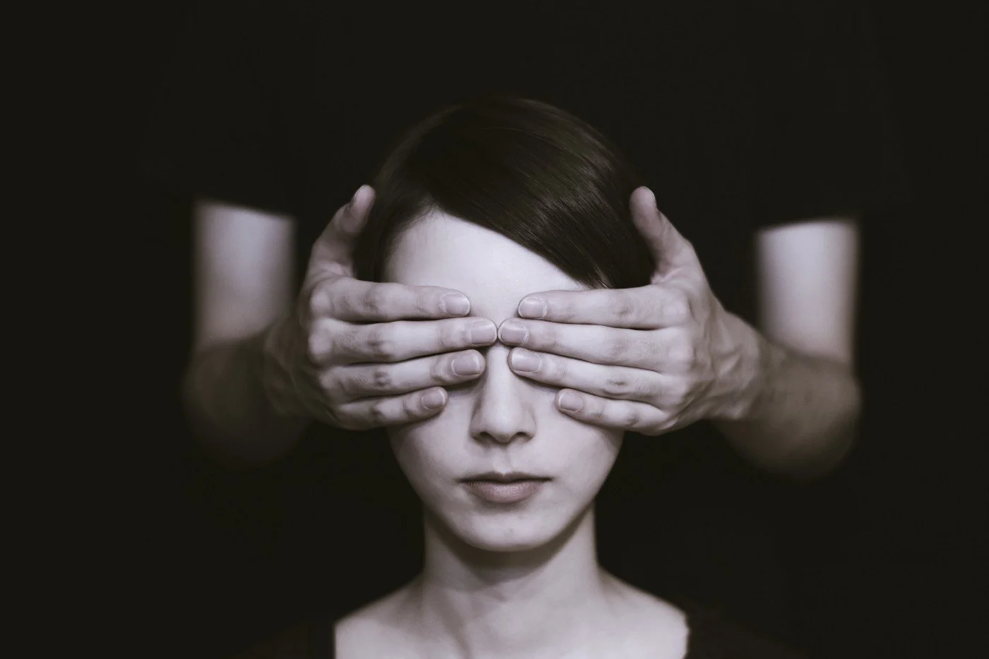
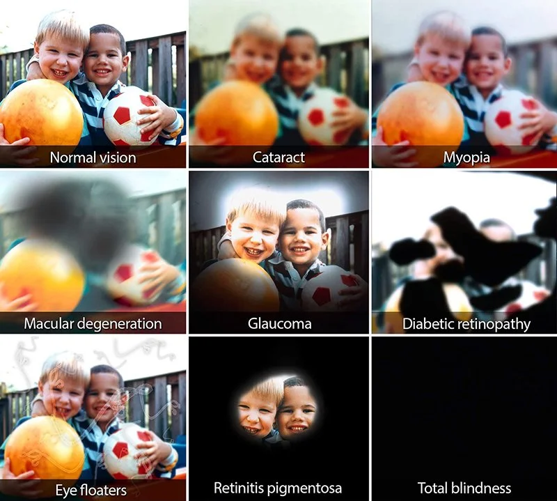
WHO ARE VISUALLY IMPAIRED?
My focus was to cater to the demographic of ‘partially blind’ as it encompasses a wider range of spectrum between Normal Vision and Total Blindness.
AND HOW DO THEY SEE?
Methods like visual impairment simulation helps to understand the user, how they see the world and their challenges. This section of the society is vastly ignored in the technological advancements of our times, making digital products highly inaccessible.
PRIMARY RESEARCH
Understanding the User
Participant criteria: 60%of the individuals with a seeing disability were between the ages of 25–64 yrs. This demographic was critical for the project because persons who are diagnosed with visual impairment at a later stage in life often do not have relevant help or guidance to navigate through obstacles. Two key assumptions based on secondary research were that educated visually impaired persons are well versed with a smart phone and are motivated in learning and working.
1.
2.
3.
4.
25-64 years old
Visually impaired or partially blind
Well versed with a smartphone
Motivated in learning and getting hired
KEY FEEDBACK//QUOTES
“I don’t know why employers are hesitant to hire us.”
“I wish employers would trust that we can do the jobs that we apply for.”
“I keep sending a resume to HR personnel but get no response.”
KEY THEMES + INSIGHTS
6 key themes emerged which helped to validate the importance of my problem space. Further, their corresponding insights helped me craft a How Might We question, thus narrowing down my scope of work.
1.
Digital Accessibility + Literacy
Requires to be more inclusive to accommodate most forms of visual impairment.
2.
Emotional + Mental Health
There is a significant sense of loss which includes loss of identity, opportunity resulting in low self-esteem.
3.
Specialized Education
Specialized education and over-qualification is required to compensate for visual deficits.
4.
Tutoring + Mentorship
Tutoring and mentorship is essential however, it is not always available.
5.
Physical Barriers
Although steps are taken by building code guidelines, community mobility is still a significant concern.
6.
Resistance
Employers do not have the assurance and confidence that a visually impaired person can execute the job at hand.
KEY INSIGHTS SELECTED: DIGITAL ACCESSIBILITY AND RESISTANCE
I chose Digital Accessibility & Resistance as two key themes because they have the most potential to address the problem space instead of its symptoms.
THE CHALLENGE
How might we help partially blind persons integrate into the workforce in order to achieve employment equity?
DEFINE
PERSONA + EXPERIENCE MAPPING
With all the information I collected during my secondary and primary research, I created a persona which was used to ensure my design solution was anchored by my target user's goals and needs. Further to that, their experience journey was mapped to better understand the stages in which an intervention might be warranted.
PERSONA
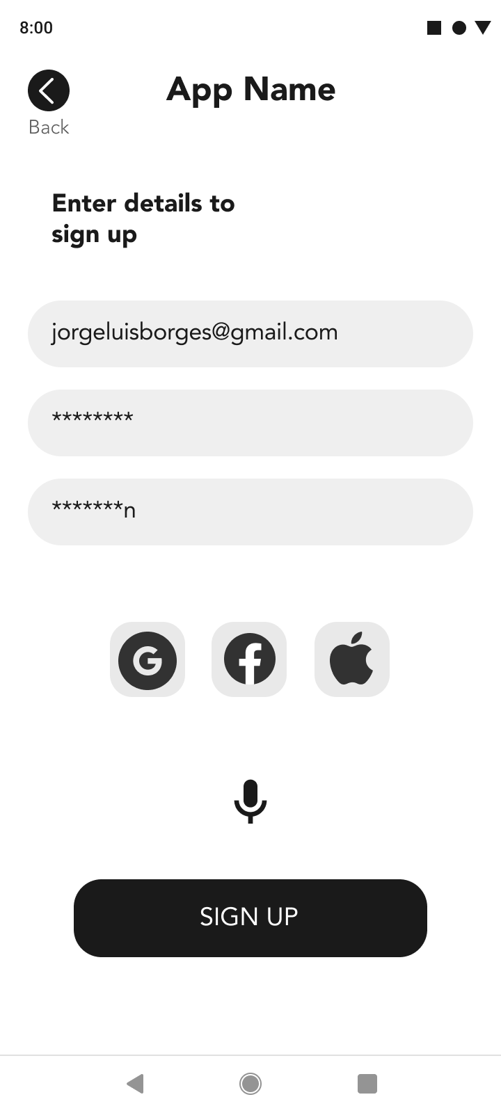
Jorge Borges is 36 years old and lives together with his wife and two children in Canada. He has studied English and Spanish at university level and is currently unemployed. He has color blindness & loss of partial vision since 6 years and has struggled to find meaningful employment opportunities. He wants to have access to the same job opportunities like his sighted peers.
EXPERIENCE MAPPING
I started by tracing Jorge’s journey as he navigates through the labyrinth of employment being a visually impaired person. He starts of being excited for his work application but ends up in disappointment as employers reject his application without a clear reason.
IDEATE
USER STORIES + TASK FLOWS
I began the ‘Ideation’ phase following the structural framework of crafting User Stories in the format of
As a... I want to... So that...
CORE EPIC: DEMONSTRATE SKILLS
As a visually impaired person I want to demonstrate my skills so that I can showcase my abilities to potential employers.
Some of the user flows selected to create a task flow were as follows,
Create a profile to show the person behind the resume.
Upload an image/audio/video/text in the form of a portfolio to showcase abilities to potential employers.
Share uploaded projects via a portfolio to potential employers through job networking portals.
TASK FLOW
PROTOTYPE
SOLUTION SKETCHES
During the initial sketching phase, 4 key frames were conceptualized and developed that would become the backbone of the app.
1. Type of Visual Impairment Screen
2. Type of Employment & Assistive Technology Screen
3. Project Portfolio Screen
4. Uploading Work Samples Screen


LO-FI WIREFRAMES
Solution sketches were developed into Lo-Fi grayscale wireframes to understand the usability of the app. This was an important step as the app started to get its form and purpose clearly laid out. I used a large and bold typeface to better align with my user group. 3 key features of the app were,
1. Screen should calibrate and adjust itself based on the user's visual requirements for components such as font size, colors and contrast.
2. Clear form with minimal and relevant information.
3. Voice feature to minimize typing if necessary.


TEST
USABILITY TESTING
Executive Summary
The purpose of the usability test was to gain feedback and insight on how a user interacts with the digital solution. There were 10 testers in total with 2 rounds of 5 testers each that took place over a span of 120 mins through Zoom.
Scenario
Participants were given a scenario to put themselves in the user’s shoes along with given tasks to further evaluate the usability of the app.
TASKS
Main Task: Create and share your accessible multimedia portfolio of work with job networking sites.
Create a profile
Add and describe projects you want to share.
Upload relevant files to projects to demonstrate your skills.
Share your profile on job networking sites for employment.
ROUND 01
Feedback received from Round 01 of user testing was pertaining to the intuitiveness of the iconography used and its location. Some users felt that the location of icons, their meaning can be better explained. Further to this, a confirmation screen was missing, which could indicate that the process of sharing the portfolio was complete.
These changes, as seen below, were incorporated to further improve the usability of the app.


ROUND 02
After incorporating the changes from Round 01, updated wireframes were tested with 5 additional users to get a more nuanced understanding of the usability of the app. There was less feedback compared to Round 01 testing as users pointed out minor suggestions for features and their location on the app. These suggestions were incorporated as seen below.


REFINE
BRAND IDENTITY
The identity of the brand is developed to highlight the feelings, emotions and sensory reactions I wanted to invoke in visually impaired persons. The words below reflect as affirmations for their ambition and capabilities.


Confident, Approachable, Assuring
Creative, Boundless, Simple
Aspirational, Reflective, Motivational
BRAND NAME EXPLORATION
I used brand adjectives to guide me as I charted through different brand possibilities and options.
The explored names were tested with intended users to access their initial response.
MOODBOARD + COLOR EXTRACTION
I was looking for inspiration from some of the instances occurring in natural phenomena such as reflection, mirage, mist, fog, haze, smoke, blur, bokeh etc. These elements often have great presence of atmosphere, light and darkness in balance.
COLOR PALETTE
The pop of color is vibrant and uplifting, going with the overall tone of the app as suggested in the keywords previously. Colors were extracted from the moodboard to develop visual tonality and was tested for accessibility requirements.
ACCESSIBILITY
Beyond Vision is brand that focuses on accessibility as the user group are visually impaired persons. Accessibility checking tools as indicated below were used to check legibility of the app.
The final color palette went through accessibility checks, and the following color combinations were selected for the final app.
Accessibility checking tools:
Multiple tools were available to ensure that the brand colors matched accessibility contrast considerations and met the requirements of the WCAG AA2.1 Accessibility Standards.
- Adobe Accessibility Contrast Checker | Github Accessible Color Palette Builder | Stark Contrast Checker (Figma) | Web Accessibility In Mind


TYPOGRAPHY
Logo & Primary Typeface
Designed by the Braille Institute and Applied Design Works, Atkinson Hyperlegible, named after the founder of the Braille Institute, has been developed specifically to increase legibility for readers with low vision, and to improve comprehension.
Having a traditional grotesque sans-serif at its core, it departs from tradition to incorporate unambiguous, distinctive elements—and at times, unexpected forms—always with the goal of increasing character recognition and ultimately improve reading.
Why ‘Atkinson Hyperlegible’?
Atkinson Hyperlegible helps visually impaired persons - recognize footprints, differentiate letterforms, understand ambiguous characters and forms.
WORDMARK EXPLORATION
Different options were explored that represented the brand and its intent. These were initial renditions of the wordmark in hand-drawn form.
The finalized wordmark for the brand signifies humility and simplicity. It is easy to read in small caps and hence easy to recognize the brand.
MOBILE APP ICON
For the mobile app icon I tried various possibilities with the name of the brand (see below), but it was too literal.
I wanted something symbolic that can be recognized with one glance. The concept I tried to develop was a simple gradient of color coming out of darkness. The central icon was chosen as it features the colors selected from the final palette based on accessibility and mood-board.
HI-FI PROTOTYPE


MARKETING SITE
In order to market Beyond Vision, I created a responsive marketing website that could be used to draw people in to download the app.
The process of creating this website was similar to that of creating my app; I started out with UI inspiration, created sketches, designed multiple rounds of low to mid-fidelity wireframes, conducted user testing, and then applied my brand’s visual identity to create a high-fidelity interactive site for web and mobile.


BEYOND VISION ON THE iPad
Next natural transition for my user would be an alternative platform with a portable larger screen than a mobile device. This suits perfectly for an iPad. It is easy to navigate and upload projects on a bigger screen and is more suitable if the user prefers a landscape format.
Users can show their work on the go due its portable quality thus enabling better in person networking opportunities and potential job interviews.


BEYOND VISION’S FUTURE
1. Testing the app with more than 50 visually impaired persons.
2. Speaking to potential employers and HR managers about the usability and logistics of the app.
3. Develop other features of the app along with multiple user flows.
4. Speaking with tutors, mentors, aids and accessibility advocates to get a holistic understanding.
LEARNINGS FROM THE PROCESS
1. As many as 8 in 10 Canadians have never worked with someone who is blind or partially sighted. Sensitizing the sighted persons is also a necessity for any solution to work.
2. Trust the process and always empathize with the user.
3. Use my skills and knowledge to help those who don’t have a voice.
THE ORACLE
Artefact created 'The Tarot Cards of Tech' to help creators of all kinds consider the impact of technology. The two cards below contain provocations that will help me foresee unintended consequences, but also reveal opportunities for creating positive change.
I chose this prompt because it is important to question the role of trust, authenticity and transparency in the design of the app. Following are some of the possible issues that might arise.
People will lose trust in the product if no visually impaired persons get any jobs after repeated trying. Also, if the security features of this app are breached revealing which type of visual impairment a person has, it might create comparisons and unethical divisions in the process.
If the app becomes a social media site, then it would lose it's purpose of being an app that empowers visually impaired persons for potential employment.
If the business model took an analytics route to see how many views portfolios are getting thus creating discrimination in the process.
I chose this prompt because it's possible that an imposter can try and take advantage by pretending to be visually impaired.
Under such pretense, one could potentially send applications and be called up for interviews by providing fake supporting documents. Other way could be if it is used by sighted persons as a portfolio building app. This would defeat the purpose of the app helping a marginalized community.
One of the ways someone can exploit this, is by hiring visually impaired persons as cheap labor. With security threats this information can be found out by knowing which persons have severe visual impairment and are in greater need for employment.
VIEW MORE PROJECTS