Donate with a Porpoise
Improving porpoise adoption experience to inspire donations to marine conservation.
Project Overview
Project Type: Academic Project (Sprint - BrainStation UX Design ‘22)
Timeline: 4 days
Team: Benjamin Gluch, Camilla Lo, Joanne Oh & Ameya Joshi (UX Designers)
Tools: Figma, Invision, Adobe Indesign, Adobe Photoshop
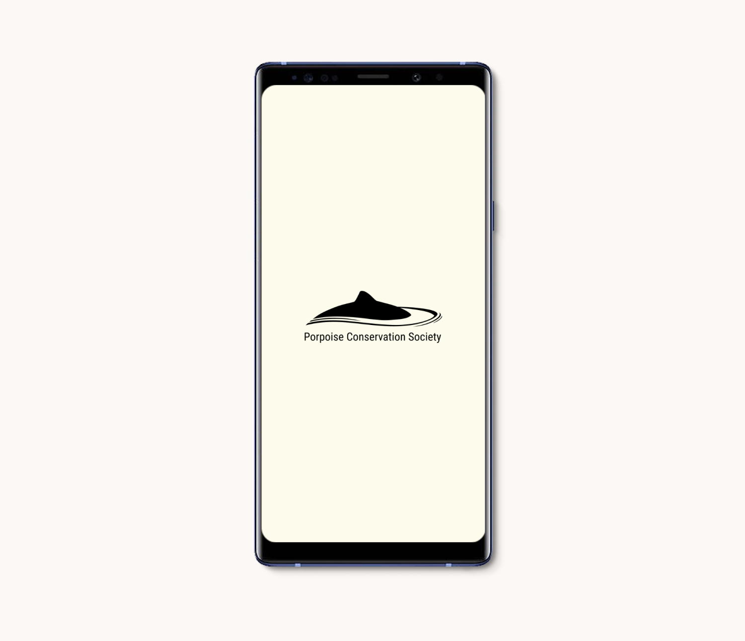
Donate with a Porpoise is a mobile app for the non-profit organization Porpoise Conservation Society developed at BrainStation’s UX Design Bootcamp as a part of a Design Sprint.
This project entailed creating a UX design process involving research ideation, interview analysis, existing usability testing and user interface design with emphasis on the donation experience.
Artifacts: User Journey, Persona, Sketches, Wire-Frames, User Interface Design, Website Homepage.
Skills & Methods: User Research, Interviews, Prototyping, Usability Testing, UI Design and Website Redesign.
About the NGO
Porpoise Conservation Society is a non-government organization and a registered charity dedicated to the conservation of all species of porpoise and their habitats.
PROBLEM SPACE
By not having a mobile platform, we discovered that our chosen organization did not fulfill the needs of millennials, a key demographic that is willing to donate to non-profit organizations if catered to through their preferred device.
DEMOGRAPHIC
From our research, we have found out that 40% of the millennials are enrolled in a monthly donation program, spend 3.7 hours every day on their phone and are most responsive from digital reach, rather than from the physical world.
40% of Millennials are enrolled in a monthly donation program.
Millennials spend 3.7 hours every day on their phone.
Responds best to social media and text messages exposures.
USER JOURNEY
We tried to put ourselves in the shoes of millennials and map their journey.
1. As millennials spend most of their time on phones, they would typically stumble upon a video about porpoise endangerment.
2. Curious to find out more, they would search and browse through the website and read up about the organizations' work and ways in which they can support.
3. One of the interesting ways in which they could support is through a symbolic adoption feature. As they navigate through this feature, they are left frustrated with lack of relevant information and disappointing incentives.
5. They finally leave the site without making any donation.
ASSUMPTIONS
Based on our secondary research, we identified 4 key assumptions.
1.
3.
Millennials don’t want to read lots of information to get fully informed about an NGO.
Millennials want to have an emotional connection with what they are donating to.
2.
4.
Millennials want to easily absorb the organization’s information through less text and more visual content.
Millennials want NGOs to vividly demonstrate the impact of their donations to trust the organization and how their money is being used (high standard of transparency)
INTERVIEW FINDINGS
In order to understand our user group and their journey through porpoise.org's website, 5 interviews were inducted and the findings were synthesized into 3 main themes.
1.
Users felt that the website lacked genuine inspiration and engagement. That there was no urgency and hence no pressure to take any action.
2.
Like many charities and non-profit organizations, it was very unclear what the donations and monetary contribution was used for and what kind of impact it was having on the larger issues.
3.
The website lacked visual content and was too text heavy thus lacking hierarchy of information.
DISCOVERING OPPORTUNITY
Although initially users showed a lot of interest and excitement at the porpoise adoption feature, they were eventually left disappointed with lack of specific information and a boring token certificate.
We saw an opportunity with this feature and wanted to enhance the user experience by building emotional connections between the users and adoption incentives.
THE CHALLENGE
How might we improve the current porpoise adoption experience to be more engaging for millennials in order to inspire them to donate through a mobile app?
PERSONA
Based on our interviews and research findings, we created an archetypical persona that would help us navigate as we ideate a solution.
Tina is a graphic designer from Toronto who wants to contribute her money towards charity more frequently, but is often left frustrated with the lack of clarity and engaging content. She wants to know how her donations are used and wants to feel rewarded for her contributions.
IDEATE
UI INSPIRATION
We found our UI inspiration with content that has engaging visuals and simple functional features that can be implemented through our wireframe and prototypes.
The old website was overwhelming, dark, plain and unengaging. We wanted to implement colors that make users feel excited, inspired and curious towards the organization. This could be achieved by adding a clean font style and text that won’t intimidate the user.
BRINGING A SOLUTION TO LIFE
Research and UI inspiration ideas helped us sketch out some potential design ideas. There were 4 key screens that were identified to improve upon the donation experience via method of ‘virtual adoption.’
1. ‘Adopt a Porpoise’ home screen with types of different species.
2. ‘Porpoise profile’ screen with quantitative data.
3. ‘Virtual Porpoise’ screen which can be shared and acts as an incentive to donate.
4. ‘Payments’ screen to complete the process of donation.
TEST
USABILITY TESTING
During the usability testing, 3 key issues were identified and addressed.
1. Locked icons feature.
2. Adoption amount.
3. Utilization of donation amount.


PROTOTYPE
HI-FI PROTOTYPE


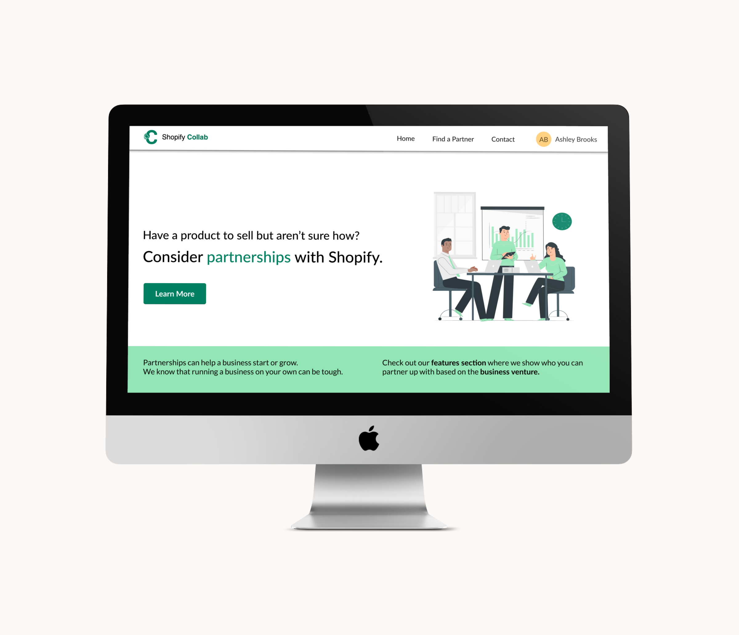
MARKETING WEBSITE
We created an updated version of the desktop website that will serve as an extension to the mobile app and allow the users to get more in depth information on the organization, it’s mission and ways to donate and get involved.


PORPOISE.ORG - THE FUTURE
1. Target more age appropriate demographic to increase user engagement and awareness.
2. Multiple rounds of prototyping and wireframes for additional features along with user testing.
3. Continue improving the website for a better user experience.
LEARNINGS FROM THE PROCESS
1. Engaging users with meaningful content that shows purpose and identity of the organization is crucial.
2. Setting up incentives and rewards for the user while they learn more about the organization, its intent and the user’s preferred role in it.
VIEW MORE PROJECTS